#I think it’s a default procreate one
Explore tagged Tumblr posts
Text
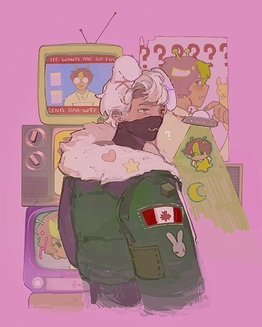
ethogirl?
#drawing ANYTHING and having to play the game of Should This be Tagged as Trafficshipping#also using this marker-like brush that’s a LOT of fun#I think it’s a default procreate one? but will have to check#I really like the composition on this hehehe it’s cute#mcyt#mcyt fanart#hermitcraft#hermitcraft season 10#etho#ethoslab#smallishbeans#boat boys#etho fanart#smallishbeans fanart
3K notes
·
View notes
Text
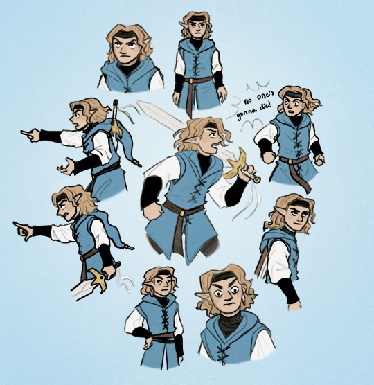
This is a Blue’s Fabulous Expressions Appreciation Post
Aka I was struck with sudden inspiration and drew Blue in every @linkeduniverse panel from @luna-lovegreat’s post
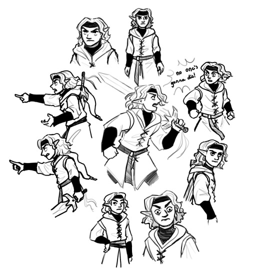
Also here is the lineart XD
#Wavy hair my beloved#BLUE’S GRUMPY EXPRESSIONS ALSO MY BELOVED#My art#lu four#lu blue#Lu colors#linked universe#linked universe panel redraw#linked universe fanart#art#linkeduniverse#lu#Linked universe four#four linked universe#ok but blue is so relatable#My favorite color I think#I mean#light blue is literally my fav color but blue is also my fav of four’s colors#also#WHY DID NO ONE TELL ME THE DEFAULT PROCREATE AIRBRUSH IS SO WONDERFUL#ALSO also#I AM FOREVER AMAZED BY JOJO’S TALENT#SHE IS SO SKILLED WITH EXPRESSIONS AND POSES
701 notes
·
View notes
Text

fed up with my art style so i painted a wizard
#ray's tag#undescribed#mcyt#mianite#waglington#keys' art#i have NOT been happy with my art style lately so i picked one of procreates default color pallets and only let myself use one brush#and didnt make a sketch and just fuckin Went For It.#i think being in outer space would be enriching for him. i think she would enjoy it#btw there is a song that goes with this drawing!! it is contact (by daft punk) :]
43 notes
·
View notes
Text
Barriss portrait because I'm going through that phase where I all of a sudden hate the brushes I've used for 3 years. I edited my existing lineart brush and I like it better but it's not perfect and I'm struggling to find one I like more because I don't know how to describe it!
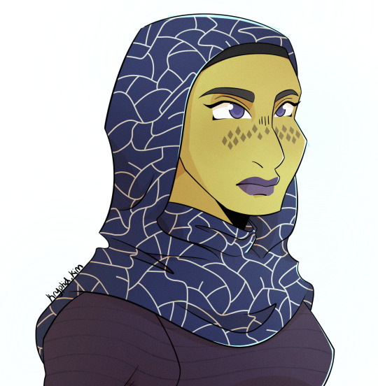
#the kind of brush I'm looking for is one of the default csp ones I think#but it doesn't exist in procreate#and I also don't know what the name is so I can't find a recreation or info about it to make one myself#star wars#star wars fanart#the clone wars#barriss offee#kryptidkreations#tales of the empire
44 notes
·
View notes
Text
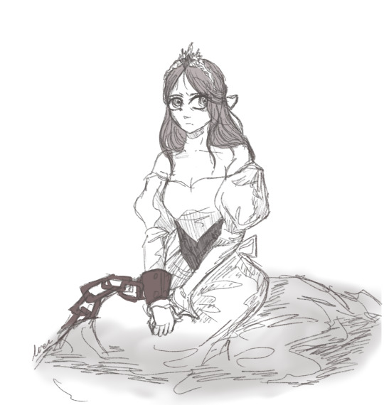

if freed, she will end the world.
slay the princess?
#bravely default 2#inanna#bd2#bd2 spoilers#bravely default ii#slay the princess#slay the princess spoilers#stp spoilers#mine#myart#bdart#procreate#i mean. the parallels. they're very strong#i think i pulled off the first drawing pretty well but my very limited skills ran up hard agianst the second one. did my best
93 notes
·
View notes
Text
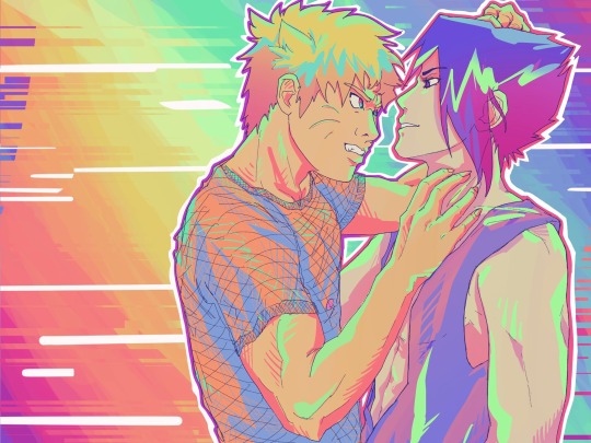
My apologies to your eyeballs.
#when I have art block I like to grab one of my abandoned wips and go at it with the most obnoxious color palette i can find#sasunaru#narusasu#sns#naruto#this was procreate’s default palette ‘flourish’#but i think a better name for it would be ‘aggressively neon’ lol#my fanart
267 notes
·
View notes
Text
one day i'll get to write about monsters/monstrosity, which despite my general research interests in violence seems to be a white whale in terms of actually writing stuff involving it.
#mothers and monsters term paper one day you'll see the light of day. maybe#sophies ramblings#i am thinking constantly about the abject and also aristotle's definition of the monster#(that being essentially 'that which does not resemble its father is monsterous'#thus woman is monstrous by default#and dangerous by default#he explains that for like. procreation women are necessary but obviously that doesn't make the monster statement less interesting#this is all from 'on generation'
0 notes
Text
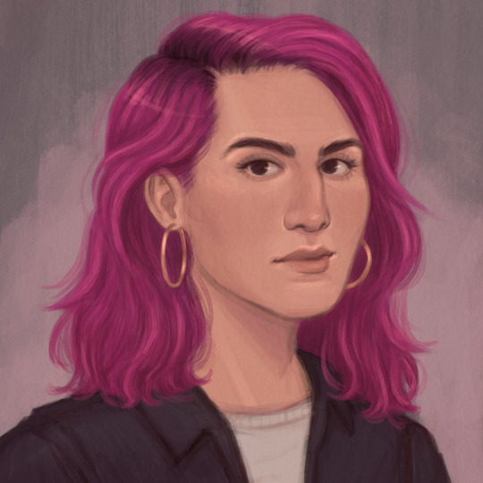
first attack! this one is for Twilfitt on artfight
(a little bit of my process under the cut)
I actually started drawing this character last year, but was never able to finish it because I struggled a lot with it. Even though I thought the sketch looked ok on its own, for some reason whenever I tried coloring or painting it, something just looked wrong and I was never able to get it to look right before the end of artfight.
Here is that sketch from last year:

(Looking back on it, I still think it looks fine & I'm not sure why I had so much trouble with it. Maybe in a couple years when I've improved some more I'll be able to see some flaw in it, or maybe I was just getting so burnt out last year that even things that should be easy felt impossibly hard?)
This year, I still wanted to draw this character as a revenge/thank you for Twilfitt drawing one of my characters a couple years ago. So I decided to try again, abandoning the old sketch and starting from scratch.
I did decide to keep things fairly easy for myself by making the drawing a simple portrait, like last year's sketch. (Shoulders up portraits like this are very much in my comfort zone, but I've been trying to break out of that a bit with the other attacks I've been working on this year.)
The painting process was pretty straightforward for the most part - except for when I went back and looked at the references again, and realized that her hair should be shorter, and that she probably wouldn't be wearing as much makeup. I was already pretty far into rendering at this point, but it was easy enough to fix those two things.
Here is that alternate version, as a bonus!

(this ended up being kind of long but whatever lol, that's what read mores are for 🤷♀️ I don't even know if anyone will read this anyway)
#my art#procreate#artfight 2023#finished this a few days ago but forgot to post it here#i used procreate's default watercolor brush for this one!#i think it worked really well for the hair but was harder to use for rendering the face#though i do kind of like the painterly brushstrokes effect it has#also think i might start adding some additional info or steps of my process to certain things like this#just bc this blog is kind of like my sketchbook/journal and i want to be able to look back at things and see more than just the end result#to help myself remember how i did certain things in case i want to recreate any effects or anything#this is also why i try to note the art program and brushes i used for each post bc i tend to experiment a lot with those things#and bc it might be helpful to anyone who happens to see this as well
0 notes
Text
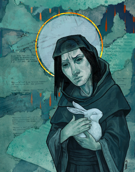
A Prayer For The Lost Ones — done in Procreate.
I drew the face without any idea what the rest would be, and just hoped I’d figure it out as I went along. There were multiple false starts, but eventually this settled out. Apparently I default to saints and rabbits.
I think the rabbit is fine. Not so sure about the saint.
686 notes
·
View notes
Note
Hello! I'm a big fan of your colour choices in your art especially for your painting style pieces(if that's what you'd call those?). Is there a technique behind how you pick the colours for your works so they work as harmonically as they do? Studying your art fr fr
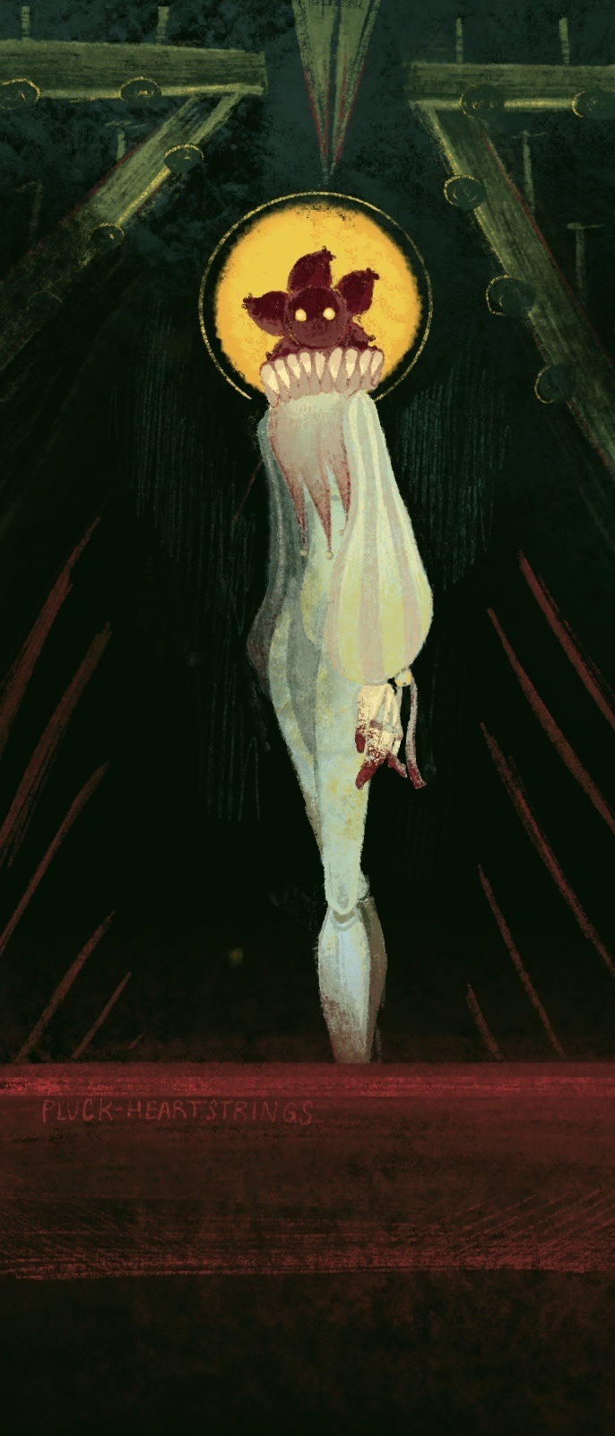
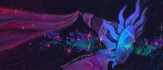
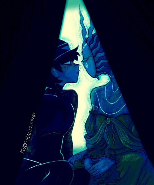
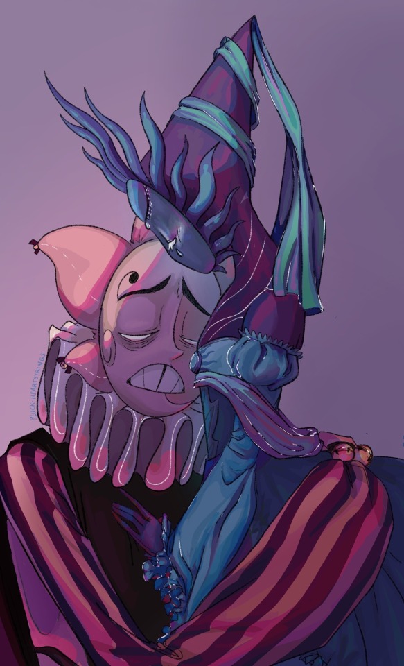
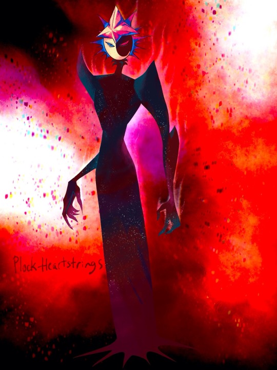
Here's some of my favs of yours and just to show what I mean by paintings :] so very tasty. If you feel like it's purely intuitive I get that! and thanks for blessings our eyes anyways!!
Lmaooo Xitsen I wish I could tell you I have a magical formula when it comes to colour. In reality, I have a very frantic process /sweats
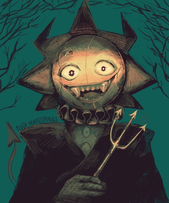
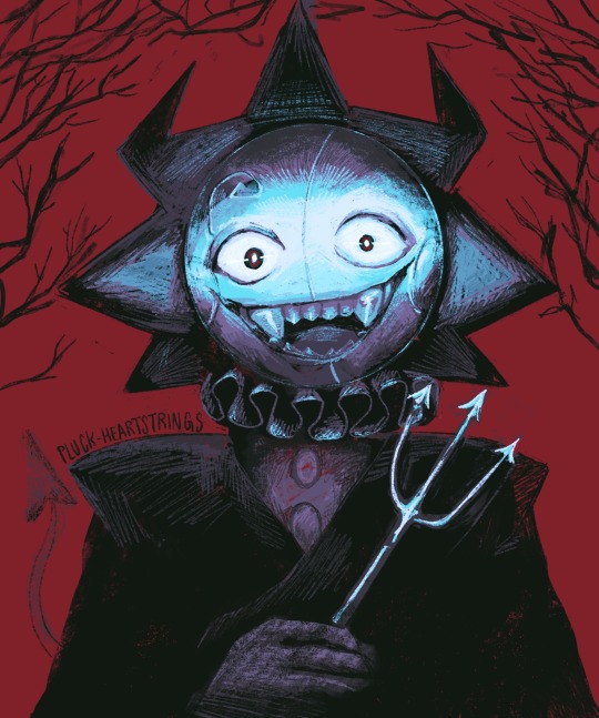
The first three images actually had designated ‘colour reference’ that I was using. Basically I had a pose ref and a colour ref. I don’t always use a colour ref, but for these three I did. AND EVEN THOUGH I DID, the final product ended up being very different from the reference. I also chronically merge layers. Like all the time, even if I regret it sometimes, I can’t be stopped.
I remember specifically on the Sun one, I was working with two layers; the background and the figure. Then I duplicated the Sun figure, shifted the colour in the ‘hue’ slider, and fiddled around with some of the layer filters. I merged those two layers, and used my trusty 6B Procreate Pencil brush (default) to blend in some of the colours that looked wonky. And I don’t mean smudge, I mean eye dropper and sketch on top. Messy messy.
The last two were a bit different but still kinda the same. I frequently duplicate layers I’ve already done and mess around with the colour on the hue slider, using the layer filters all wild. I just try and see what looks good, but I try to stick with at least a cool shadow with a warm light, or the opposite.
Basically, fiddle with crazy colours and win silly prizes. My colours don’t always turn out nice, but I’m flattered that you found the ones that I also like. The first three are gems in my collection that I think back on like ….how did I do that…?
As a special bonus to prove my point, here’s an art attack I did for last year that started with an entirely different colour scheme from the final.
On the left is the colour scheme I chose from colour reference (I think an old movie poster) and the right is the more ‘vampiric’ one that I ended up choosing. But in all honesty, there were a bunch of colour schemes that looked good with this piece. It’s a good example of cool shadows, warm light and vice versa.
#ask pluck#xitsen….asking me?.? for art advice#I need to go lie down#Xitsen is the reason Eclipse and PMH Moon have claws THERE I SAID IT
55 notes
·
View notes
Note
Just wanted to ask, please forgive me if you've already answred this, what program do you use? Your art fucks HARD and like. I was looking at your art of the two moths over the city they die in and I was hit with the wave of "oh that looks really fucking fun actually." Like i know my art program can't do some of those effects and like, I'd love to try fucking about with them.
hi there, thank you! all my art is done in procreate and paint tool sai
because you mentioned that drawing in particular i thought it would be fun to break it down and show ppl what exactly went into each part of it so check this out
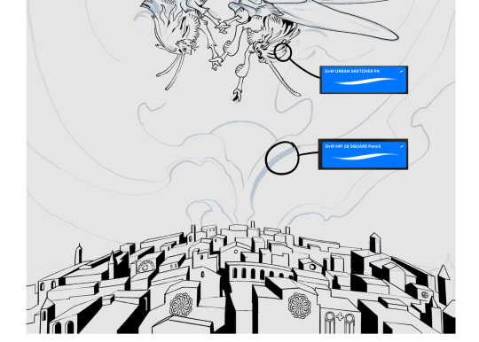
sketch & lineart - the brushes come from georgbrush.club and the urban sketcher is my most commonly used lineart brush, it has a nice irregular shape. the square brush is nice for big blocky sketches.
the cityscape was REALLY hard but basically I got a photo of the skyline of florence, traced some basic building shapes, then bullshitted the rest using the vertical symmetry/mirror tool to cut down on the amount of work (so i only had to sketch one half of the city). then for lineart I turned off vertical symmetry, turned on the two-point perspective tool, and got this:
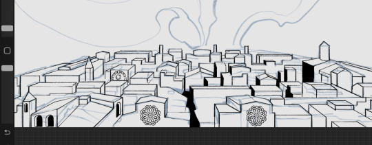
the rose windows were made using the radial symmetry tool.
I didn't like it being so flat, so I used the liquify tool to make a kind of fish-eye effect (limited success tbh). I liked how it looked but the buildings in front needed something to cover them up to make the liquification less obvious...
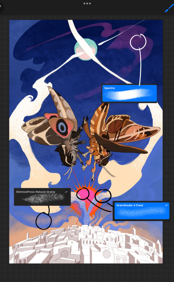
first pass colours. I felt they were very washed out, aside from the sun which i loved. I use the spectra brush (default procreate) for skyscapes a lot, I love the texture. Although the clouds were filled in using the lasso selection tool, I softened the edges using the square pencil again and added texture using true grit sampler grainy brushes. The translucency effect comes from my setting the brush as an eraser. The sun rays come from the radial symmetry tool.
Blocking in the moths' colours was done with the urban sketcher again.
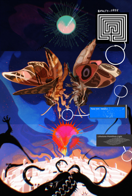
Something people may not have noticed is the labyrinth hidden in the sky! yeah I had a bunch of versions where it was more obvious but I found that it clashed a bit and was too busy, so I made it subtle. But yes. I searched for "royalty free labyrinth" and picked one.
The toner grit brush is one you've seen before if you've looked at any art on tumblr lately (this is such a popular brush) and it's from the true grit fast grit set. The pointillism brush is from the true grit free sampler pack, like my grain brushes.
I added shadows to the moths, increased saturation overall, and changed the clouds to a translucent blue (you can even see in the sun where I forgot to block in the sun itself because the clouds over it used to be opaque lol). Moon rays were drawn using the radial symmetry tool but this time with rotational symmetry off. I also moved the moon down closer to the moths because I felt that it was a bit far away, and this served to visually divide the drawing into three equal parts, so I chose to lean into that and divide the sky colours too, to show passing time, or an endless moment - morning, evening, night, etc.
And then the oroborous, I tried a few different effects on it because I wanted it to be very clearly separate from the main scene - I settled on a dot matrix newsprint texture, using procreate's onboard tool, and some heavy chromatic aberration. This is because the oroborous isn't real, it's purely symbolic and the moths' demise started when they became photographers so I liked the print media aspect there as well. The story itself is about grief without closure, cyclical violence, and sunk cost fallacy, while everyone explores an endless labyrinth, so an oroborous fits I think
what makes art fun to me is thinking up ways I can tell a story using just a single image. and sure a lot of it will be lost to an audience who isn't familiar with the characters or backstory but i want to leave enough in there that even complete strangers to my work will be able to construct a narrative about what's happening here, rather than it just being a cool image. that's my goal.
Finally I exported it to sai on my pc to give it a once-over. this is really important because the retina display on an ipad is oversaturated on purpose, to make everything look amazing and vibrant. but what this means is that on other screens, your work might look washed out. it's especially bad at displaying yellows! so i look at it in sai on my pc and i make minor adjustments, in this case I actually added another multiply layer on the moths and an overlay on their non-shadowed parts to increase the contrast there.
finally if you've read this far, I played a little trick with the caption of the drawing. yeah, THEY die... but only one of those moths is a theythem pronoun haver... the other has to survive. he isn't given a choice in the matter.
#fr you will never catch me trying to mystify my process i will explain literally everything#brushes
467 notes
·
View notes
Text
hi everyone!! my wrist is too sore to draw today, so instead i thought i'd share some of my favorite csp assets + how i like to use them! i also linked some procreate brushes at the end of the post!!
lineart brushes:
SU-Cream Pencil: i swear by this brush and i use it very often!! if you lower the pen density and use a gradient map over it when coloring your drawing, it has a nice effect. that's what i did in this drawing here! i also use this brush like i would draw on paper, so as a sketching tool. recently i've been enjoying blending it for shading. the pics below are drawn on one layer; left is more manga style while the one on the right is from a WIP of my singer sargent study, so it can be used for more realistic styles pretty well!


Found Pencil: another pencil brush that feels really nice to use, created by @/pigpenandpaper.
PS style brushes: a recreation of photoshop's (i believe) default brush. very versatile and also blends well!
analog wind variant pen: a nice pen that i like to use for lineart that is intended to have a bit of a sketch look.
zakutoro real g-pen: i used it for the lineart of this piece. although, it was drawn before i started using 600dpi in my works, so the lower resolution might make it look a bit unclear.
sets of rough pens: great for manga lineart with a rougher vibe; some of them have varying line weight.
coloring brushes:
zaku brushes: very nice and painterly mixing! i definitely recommend it for those who like to leave their colors a bit unblended.
softie marker: as the name implies, it's very soft! i like to use it for blush in chibi illustrations.
analog watercolor brushes: realistic-looking watercolor brushes. i recommend using it with csp's default paper textures, or those i linked below!
993 coloring pen: it's very soft and watery, though it can be made more solid by adjusting the paint density. i actually think it works very nicely for lineart too.
rock dog pen: another soft marker brush i like, that i once again also use for lineart and doodles.
thick coating brush set: recommended for paintings that show brush strokes.
cartoon cloud: don't let the name narrow your vision!! this has to be one of the BEST brushes for painting in my opinion, and of course it's great for clouds and explosions but so so much more!! and it's FREE try it try it!!
decoration/miscellaneous brushes:
neon pen
paper textures
symmetry move brush
close and fill without gaps
rope brush
sphere fisheye guide
flash balloon
speech bubble set: a lifesaving collection for comic artists!! dimensions and line weight can be adjusted by using the operation tool.
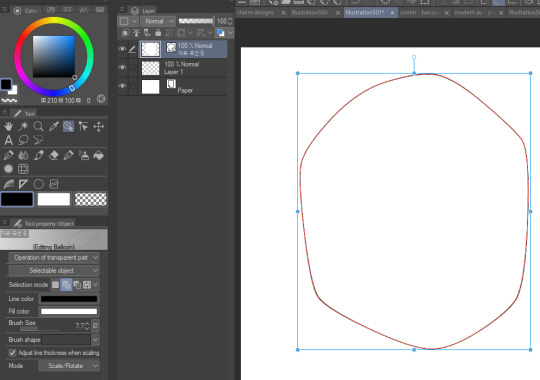
gradient map to use in color mode at 15% and another gradient map to use at 20%: the percentage refers to the opacity of the gradient map layer, but they are just the creator's recommendation and i tend to actually increase it. to use gradient map efficiently, i recommend putting all your colors (and lineart if you want) in a folder. then, right-click the folder, select "new correction layer" and then "gradient map". this allows you to modify the gradient map without worrying about affecting the original colors in case you decide not to use it in the end. to import a gradient map from your downloaded csp assets, click the wrench icon next to the name of the gradient set that's currently in use, then select "add gradient set".


you'll also notice that the creator recommends to use their gradients in "color mode". of course, this is also only a recommendation and i suggest trying as many layer modes as you like! to change a layer's mode, simply highlight the layer and click on "normal" (the default mode) and csp will display the available modes.

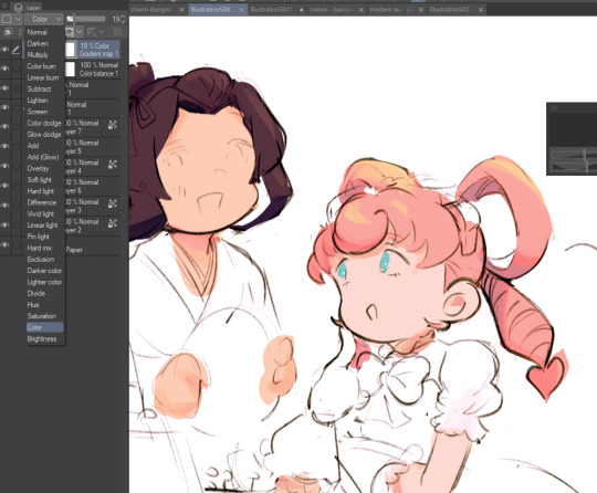
fruit ninja gradient map: fun to use if you want really drastic/vibrant colors! the names of the gradients are cute too, as you can see in the above screenshot!
BONUS: jeremy fenske's free photoshop brush pack: these aren't csp brushes per se, but they can be imported into the program! excellent for environments, i recommend watching fenske's video on how he uses the brushes to get a clearer picture since there are so many in this pack!!
BONUS 2: my good friend clem has a few brush packs for procreate that are ideal for painting,decorating drawings, and y2k-inspired illustrations, i definitely recommending checking out her shop!
in conclusion i hope this post can be helpful to you!! i tried to explain how to use the brushes as best as i could, but feel free to let me know if anything is unclear!! i hope you will enjoy using them! :D
#clip studio paint#clip studio paint brushes#csp#csp brushes#procreate#procreate brushes#brushes#tutorial#art tutorial#sort of hehe
150 notes
·
View notes
Text


don't you need them like they need you now? want an art just like this with your f/o? then just meet me at the apt for this event! this is open to anyone aged 18 and above. read the rules below before joining ദ്ദി ( ᵔ ᗜ ᵔ )

you don't have to be following me to join. but you have to be off anon though. mutuals will be prioritized. only one (1) entry per person.
open to all fandoms! my strongest suits are jujutsu kaisen, tokyo revengers, one piece, and naruto.
the pink thunder background is the default background.
⚡︎ one, when you send your ask, please attach a photo of your f/o, preferably face front. tell me if u want the photo as is or if you want anything changed. please tell me what expression they'll be wearing, whether you want to add accessories or if you want me to copy bruno mars's fit with the ballcap backwards and the sunglasses (like i did with baji). the more specific you are with the details, the better!
⚡︎ two, attach a representation of your face—a picrew, a sim, or even a selfie. do tell me what type of facial expression you want as well. don't worry, i won't post the asks and will delete them right after! i usually use procreate's eyedropper to pick specific colors but if you think the lighting is off or the colors are inaccurate in your picrew/sim/selfie, you can send me hex codes of your skin color, hair color, eye color, and lip color. if there is anything else you want to add such as accessories, please let me know. again, the more specific you are with details, the better!
⚡︎ three, keep your asks/DMs open should i have any questions. if you have concerns, don't hesitate to drop by my ask box/DMs as well.
⚡︎ four, please be patient with me. i will do my best to grant everyone's wishes and just, enjoy doing this without pressure or anxiety lol. i thought of this event bc i finally finished my yearly to-draw list so i'm free besides my pending commissions. i also need to give back to this community that has been nothing but nice to me ♡

the inspiration for this theme was my upcoming birthday art for thee satoru gojo which was apt-inspired. i will start posting finished products on the days leading up to christmas and hopefully finish it all before christmas.
i will message you back to let you know whether you secured a slot or not. please check this post occassionally to know whether there are more slots available.
⚡︎ as of [ dec 9 ] : all slots are taken—submissions are closed.
⚡︎ check out the apt’s tenants right here ! #fromaryg: rfrg

rara's favorite random game | © aryomengrande 2023
#fromaryg: event#fromaryg: rfrg#gojo made me do it HAHAHA#apt#digital art#selfship#anime#jujutsu kaisen#tokyo revengers#naruto#one piece#my anxiety is anxiety-ing#5 is enough#i dont expect this to be big#and lemme do this for fun hdjdkd#HAHAHA
69 notes
·
View notes
Note
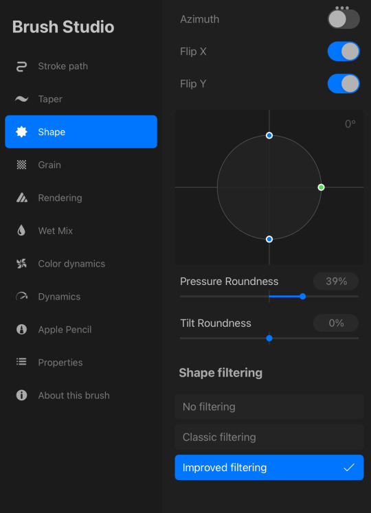
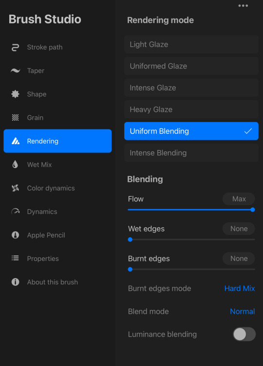
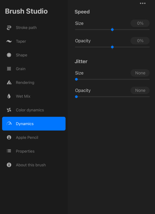
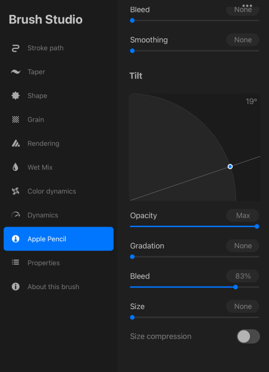
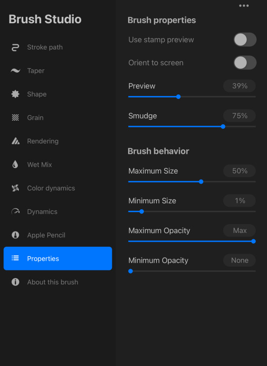
hi misha!! i think you briefly mentioned that you use slightly altered default procreate brushes for your artwork, but it would be really cool if you shared your current favourites (and if possible, their settings)! your use of texture EATS, thanks for sharing with us amazing art without fail <3
hi! thank you 🙈❤️ mostly it's this one




522 notes
·
View notes
Note
Would love to hear you elaborate on God is a SA victim if you’re up for it -Jo blood-is-the-life
Hiii @blood-is-the-life (tagging you so you'll get a notif when I answer). @ray-moo you also wanted to know about this. Also: @prosphoramuncher and @theclonehusband
*sighs* I meant to write this essay about God and androgyny and duality in Genesis 1-3 (which connects into the idea of God as being an sa victim) for a while now. @joanofarcs-stigmata I told you I'd tag you in this essay when I wrote it so here we go.
Okay, so let's start with ha-adam, the human, in Genesis 2. "Then the Yahweh God molded the human, humus from the soil, and breathed into their nostrils the breath of life; and the human became a living being." So there is one human, and as you can tell I side with the interpretation that said human is a hermaphrodite. I don't find in the word "adam" any indication that the human is male, and think rather the pronoun "he" is used just as a default.
Next however, Yahweh looks and "Yahweh God said, 'It is not good for the human to be alone, I shall make them a delivering counterpart. [...] And Yahweh God cast an deep sleep on the human, and they slept, and He took one of their sides and closed over the flesh where it had been, and Yahweh God built the side into a woman and He brought her to the human. And the human said, "This one at last, bone of my bones/and flesh of my flesh,/This one will be called "Woman" for from "Man" she was taken."
So there was 1 human that became 2 humans both man and woman. But then, Genesis 2:24 - the man and woman are married, cling to one another, and become one flesh (@sapphosremains I will respond to your question, but in short: I do believe Adam and Eve had sex in the garden, for the sake of union, pleasure, and expression of love tho not for procreation). So now the 1 that became 2 has become 1 again.
Basically this train of thought then led me to have some admittedly weird thoughts about the tree of life.
So the man and woman are invited to "eat eat" (literally what it says in hebrew lol) from the Tree of Life. Now, because God is the source of all Life, especially Eternal Life, and the Tree of Life gives eternal life to it's consumer, it stands to reason that eating of the Tree of Life is either physically or spiritually (take your pick) taking the wisdom, love, and life-giving presence of The Divine into yourself. Basically the tree is like a proto-Eucharist of sorts. It's communion by consumption. And consummation.
Now here's the weirder part: taking and eating fruit is a very common symbol for sex in the Tanakh, especially in the Song of Songs. The image is typically that of a man "eating" a woman's "fruit", which would put both Adam and Eve in the role, so to speak, of the "man/consumer" and God in the role of the "woman/fruit-giver" (think of like gender as theatre for how this logic works). The reverse is also true though: the point of the tree is to give birth to life inside of the humans, and in that way God is in the role of "man/seed-giver", and the humans are playing the role of "woman/birther".
Focusing on the first image tho, is how we get to the idea that God is a victim of sexual assault. The Tree of Life is not the only tree in the midst of the garden; The Tree of the Knowing of Good and Bad is also there, and since the Garden of Eden is a temple (do not have time to go into rn. Chart here) that means to me that the Tree of the Knowing of Good and Bad is also representative in some way of entering the Holy of Hollies taking of God's divine presence.
Except wrongly. It's like Aaron's sons storming into to God's presence and doing something violate God. But it's also like rape.
Part of the way biblical scholars read the bible is by paying attention to words and language. In Genesis 3 words like "see" and "beautiful/desirable to the eyes/sight as well as "take" and "gave" are all words that get used in similar scenes latter in the narrative. The woman "sees" that the fruit is "beautiful to the eyes" and she "takes" the fruit and "gave" it to her husband.
In Genesis 6 the Sons of God "see" that the daughters of humanity are "beautiful to the eyes" and then they "take" them as wives.
In Genesis 16 Sarai "sees" Hagar her slave girl, "takes" her and "gives" her to her husband. In the following Generation, Leah and Rachel will also "take and give" their slave girls to their husband.
In Genesis 19, it's horrible and the hyperlinks are moreso. There are 2 messengers of Yahweh going into a place that looks like Eden ("the Garden of Yahweh") to rain down fire on the city (the first time fire is mentioned is in Genesis 3 with the 2 cherubim). Incredibly suggestively. They go into Lot's house and all the men in the city, young and old, all the men of the city call out to lot so they can "know" these men (first time "knowledge" shows up is Genesis 2/3 with the Tree and then Genesis 4 with Adam and Eve). By which ofc they mean gang rape. Lot tells them not to do this "ra" thing" (Tree of Tov and Ra, Good and Bad) and offers up his daughters (!!!) instead. Because he is also a horrible guy. Anyway, he tells them to "do to them what is good in your eyes" ("the woman say the fruit was good to the eyes"). The men do not like this. Saying that because Lot is an immigrant he cannot bring justice on them. So they threaten to rape and kill him as well. Thankfully the messengers pull Lot to safety and blind the rapists so they cannot find the door (there is something important about the door but i need to meditate on it). The messengers tell Lot they are going to destroy the city because of "the outcry" which has reached Yahweh ("the outcry" is a reference to Cain's city in Gen 4, and the rape of human women and the violent warrior kings of Genesis 6). So the messengers then "rain down fire from the skies" (same language as the Great Flood which happened because spiritual beings raped human women and had violent children. Now violent human beings are trying to gang rape spiritual beings). After Lot and his daughters escape the city, the duaghters of Lot get him drunk with wine (which is ofc made from fruit) and then rape him (Ham did the same to Noah/Noah's Wife after the Flood).
That was a lot. This literature is incredibly sophisticated and this story is incredibly dense. And dark.
My point here is that one of the main ways the biblical authors talk about the abuse of women, is by using these sets of words: men see that a woman is beautiful to the eyes and take her for themselves. Or a woman sees that her slave girl is beautiful to the eyes and good for childbearing and so they take her and give them to their husbands. Eve and Adam do the same thing. They look at the tree (which I said is God's intimate presence), and then violate God by breaching a boundary that They had laid out. The analogy that came into my head when i first realized that was that of a boyfriend and girlfriend, and the girlfriend wants to wait to have sex, not as in "never" but as in "not yet", but then her boyfriend goes and assaults her. That's the same thing happening in the Garden of Eden before the Tree and why it makes me soooooo mad when people act like God was unjust in her banishment of the humans. All the language used here, is that of rape.
So... yeah. This is poorly written and I probably could've done much better writing this but it does make me very uncomfortable (to put it lightly). But I also think that seeing this in the narrative can be helpful for people who have experience the same thing or something similar. God suffers with her people.
You all owe me a nap and some cookies now lol. God bless <333
#something to meditate on#(g)arden core#jesus#christian#bible#jesus christ#faith#keep the faith#christianity#faith in jesus#tw rape#tw sa#tw abuse#tw noncon#christblr#christian faith#christian blog#christian tumblr#bible study#bible verse#progressive christian#progressive christianity#queer christian#queer christianity#tw divine name
51 notes
·
View notes
Note
You use procreate right? I'm a beginner in coloring. And your lighting and color is always so good. If you had like steps/tutorial/tips on coloring/lighting in procreate. I would pay for it even. It's hard to find a good tutorial on YouTube for procreate users, and the style that you do which is similar to the coloring style I've been trying to self teach myself for a while and failing. Anyways sorry if this is a weird ask, but I would honestly really appreciate it
One speedpaint coming right up!
Nothing weird about this question. Honestly, I struggle a lot as well, but my problem is the shape, not the colors. I suppose I can "feel" colors, that's why impressionists are my favourite (classics always help!)
I don't know if I can help with using procreate, because I'm not really savvy with it, I always use photoshop for more complex work as it is perfect for twicking lighting, changing tint etc. I prefer to sketch in procreate, because, a) it has many great default brushes, b) my back hurts from sitting on my pc, c) I can go anywhere, draw and immediately post it.
I’ll try to summarise what I figured out with procreate, and maybe give a few tips. But I don’t know if that’s the best way to use this tool. I’m just… winging it, haha
First, if you struggle with colors, look up the color circle
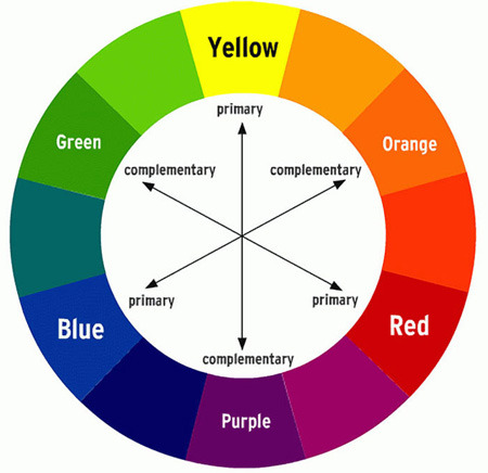
It shows exactly which color goes best with which. For example, if you use Orange for your lighting, and Blue for your shadows, it’ll look nice. Perfect, even. I love that one. Avoid using pure black for shadows, otherwise you risk to make it too… burned? Like, dirty. Be careful with Black magic.
I’ll use Zevlor here to show how it works.
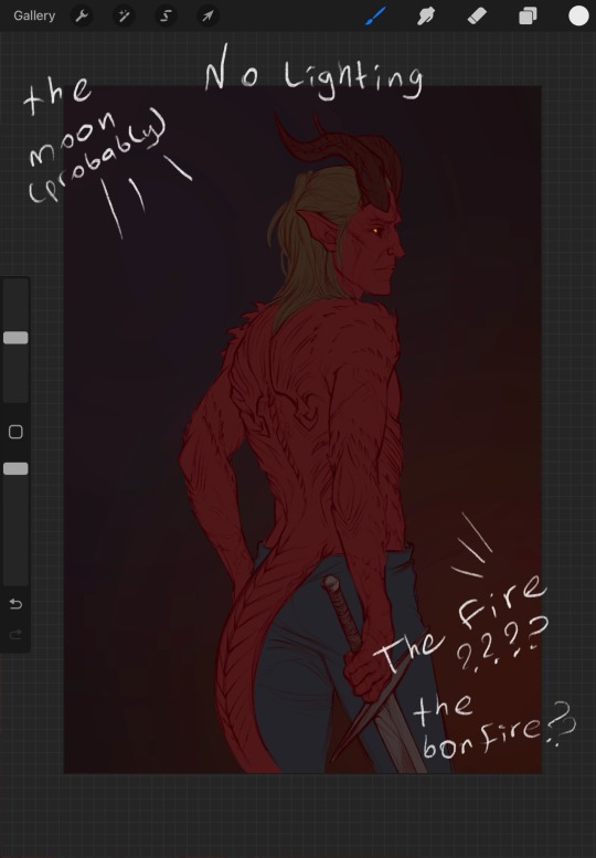
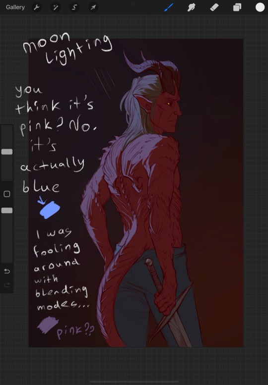
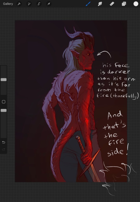
In addition, you can use the opposite color to make the character stand out. It’s really important. What’s more noticeable, red on brown or blue on brown?
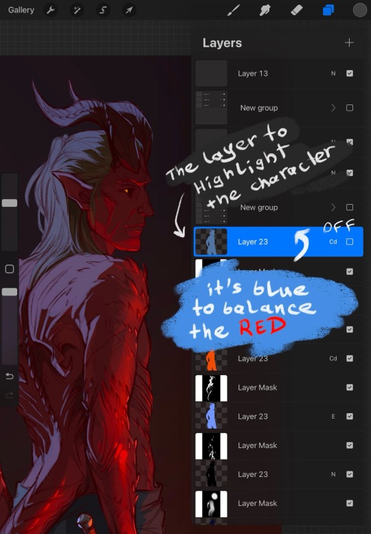
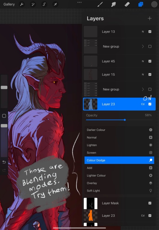
Also, learn to use masks. Really, they may be scary, but it saves SO MUCH time. Specifically with procreate, I always use them now for everything because I haven’t found the better way to avoid fixing the stray lines. With that solution, you'll need to correct only one layer at the start, the main one. Clipping masks are great to help with that, but procreate is a little uncomfortable in that regard. I’ll show what I do, perhaps it’ll make things clearer
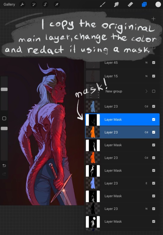
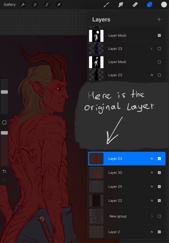
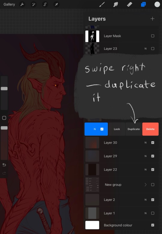
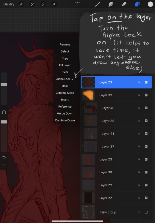
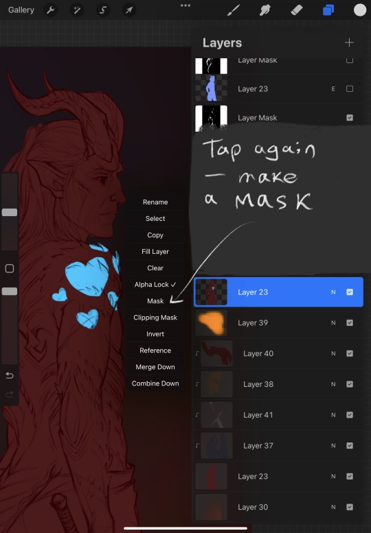
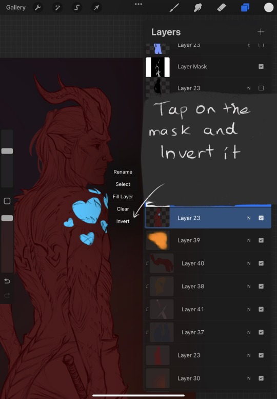
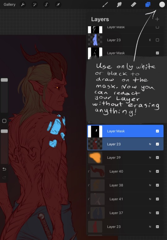
Those are the most useful things to know, I think. Masks can be used in photoshop in the same way, I have a bad habit of creating too many of them so it's crouded. And they rarely have a name. I'm too lazy to name them all
Anyway, I hope I managed to answer at least one of your questions... or not X) I tried. Good luck with exploring Procreate!
126 notes
·
View notes